Doughnut Website
Figma
InDesign
Work that was done
I was tasked with redesigning the home and order pages for a doughnut website. While I aimed to retain the original orange color theme, I wanted to enhance the site’s sci-fi aesthetic. I chose to pursue this direction because during my visit to the real-life store, I noticed that it featured spaceship and robot decorations throughout, which inspired me to integrate a similar theme into the redesign.
After completing the redesign, I needed to justify the changes by writing out all the change I made and say why I changed it and showing this to the client. To do this, I conducted user testing comparing my new design with the old one. This allowed me to identify what didn't work in the previous design and demonstrate how my improvements addressed those issues.
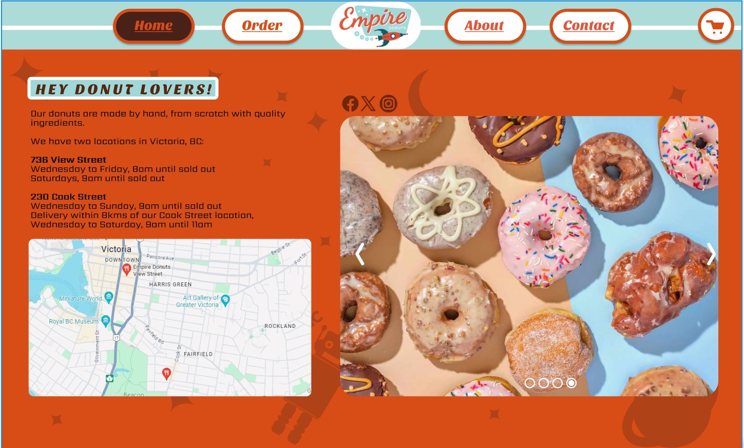
Home page
For the home page, I aimed to infuse it with more vitality, as it previously felt quite empty and unwelcoming. I enhanced the navbar with a more modern design and incorporated sci-fi elements to make it more engaging. Additionally, I felt the site lacked sufficient information for users, so I added a map to help them locate the store more easily and included more descriptive text to provide better insights about the business. Lastly, I made the images of the doughnuts more prominent, but ensured they were not overwhelming by only having one.
Home page Images
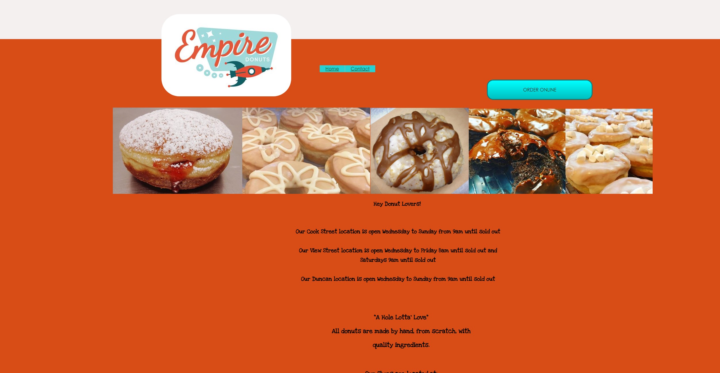
Original Home Page
New Home Page
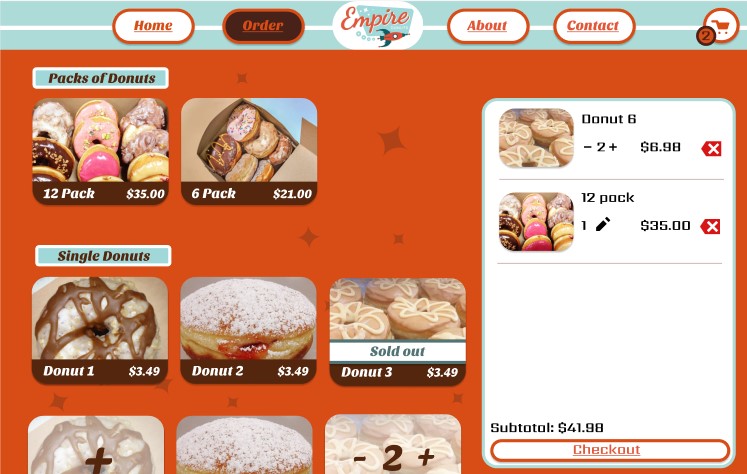
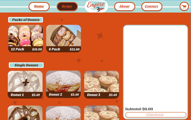
Order page
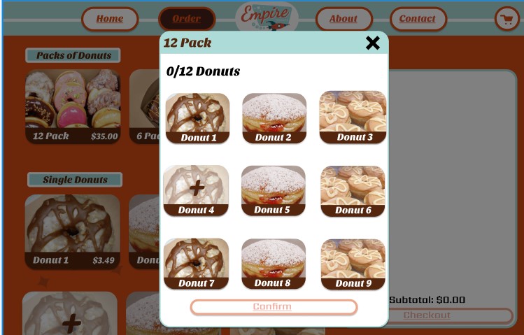
The order page didn’t align with the site’s theme and instead used the UberEats order page, which created a disjointed user experience and made users feel as though they were on the wrong site. To address this, I first incorporated the same items from the UberEats page into the new design and ensured that the cart functionality was clear. I then redesigned the layout to match the new theme developed for the home page. Additionally, I created a model for the pack of 12 doughnuts to clearly indicate how to add and remove items.
Home page Images
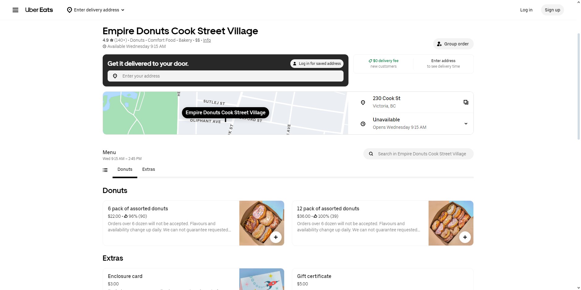
Original Order Page
New Order Page
New Order Page
New Order Page